
This page consists of a number of projects that were created during my time in school. *Scrolling down the page you will see typography used in unique and non-traditional ways. I hope you enjoy it.
_2nd%20revision.jpg?crc=241987668)
E.T. Poster

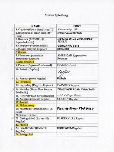
The purpose of this project was to pick a famous person and create a portrait of them in an iconic way. Steven Spielberg was my choice and after conducting more research on his background, I used some of his famous and notable attributes he is known for and incorporated that into his portrait (seen here in this photo). I used about 20 different typefaces (fonts) to help shape him and his most famous movie character, E. T.
Here's some of my process work to give you an idea of how I went through this project step by step.
The most difficult task for me was coming up with the best fonts to use (photos to the right) and how to get started, it wasn't an easy feat initially.
So I had to think outside the box and imagine myself drawing this by hand and decide what fonts worked best for values of gray for shadows, wrinkle lines, hair color and thickness to make it realistic and convincing from a distance.

-crop-u3490.jpg?crc=4288394546)
.jpg?crc=4224620648)
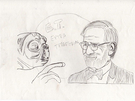
The above stock photos were used for reference and the sketch to the right of them was my first step in the process to what lead to creating it digitally.

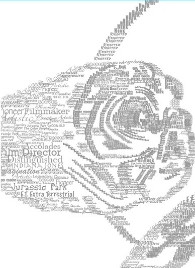
I approached this project by using all the thin, light or condensed weighted typefaces (fonts) and used those for the light areas of the composition.
Specifically for his gray hair and the wrinkle lines of his face, then used the darker and more bolder typefaces for the darker areas, like the shaded areas of his face and nose, the jacket he was wearing, his glasses and so forth. For more detailed work (see all 3 zoomed in photos).

Soldier Poster
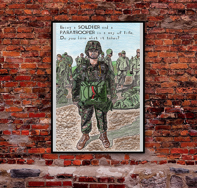
This was a two-part integrated project.
It was part of a self-portrait drawing combined with a typeface that I created from scratch called "Combat Soldier" and ultimately became a full size poster placed in its environment.
Scrolling down the page you will see some of my processes for both.
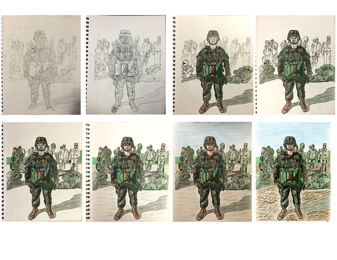
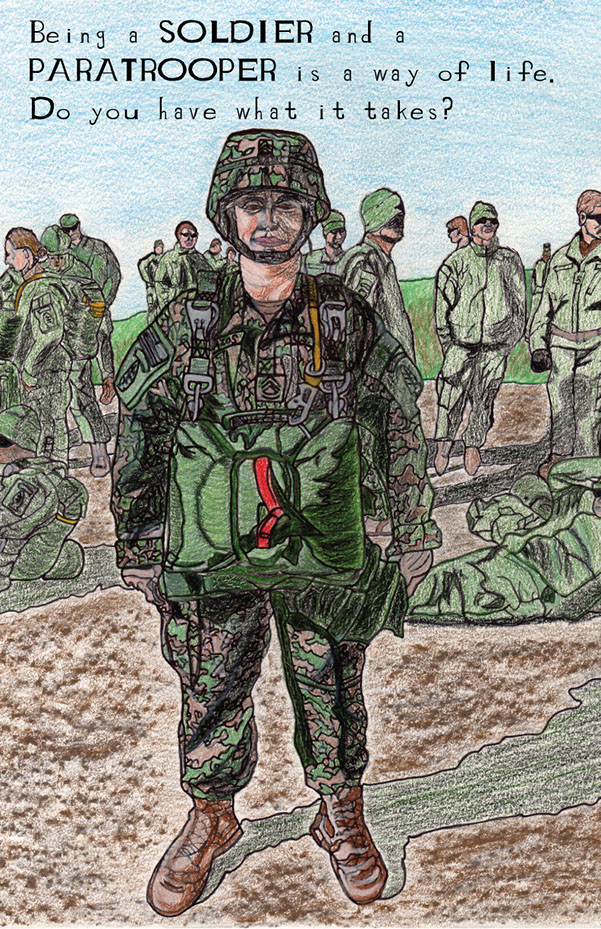
First Project:
To the right, you will see my reference photo and above is my drawing process from a sketch outline, to the integration of color and texture as you see it from the top left to right and onto the second row.
The finished drawing is on the bottom right image or scroll down to see it with my "Combat Soldier" font applied.
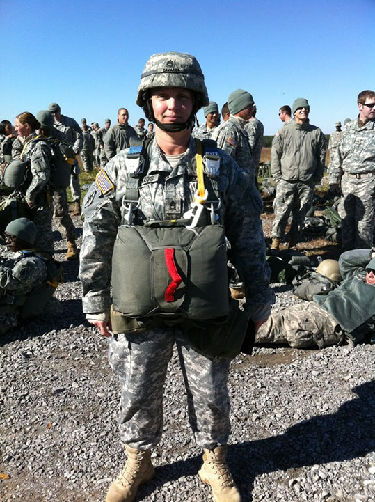
Me on one of my many parachute jumps while still on active duty.
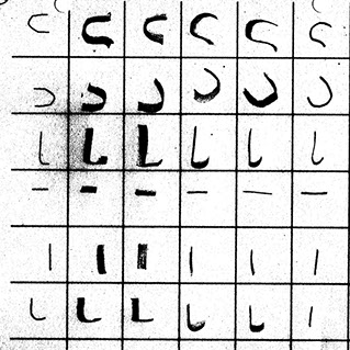
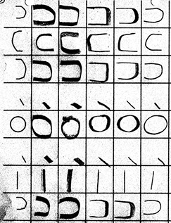
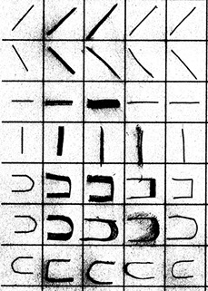
Second Project:
*Below, you will see my drawing process, from making shapes to integrating them into letters for my final look in the "Combat Soldier" type poster below this.


"Combat Soldier" Type Poster
Combined projects for final poster design.
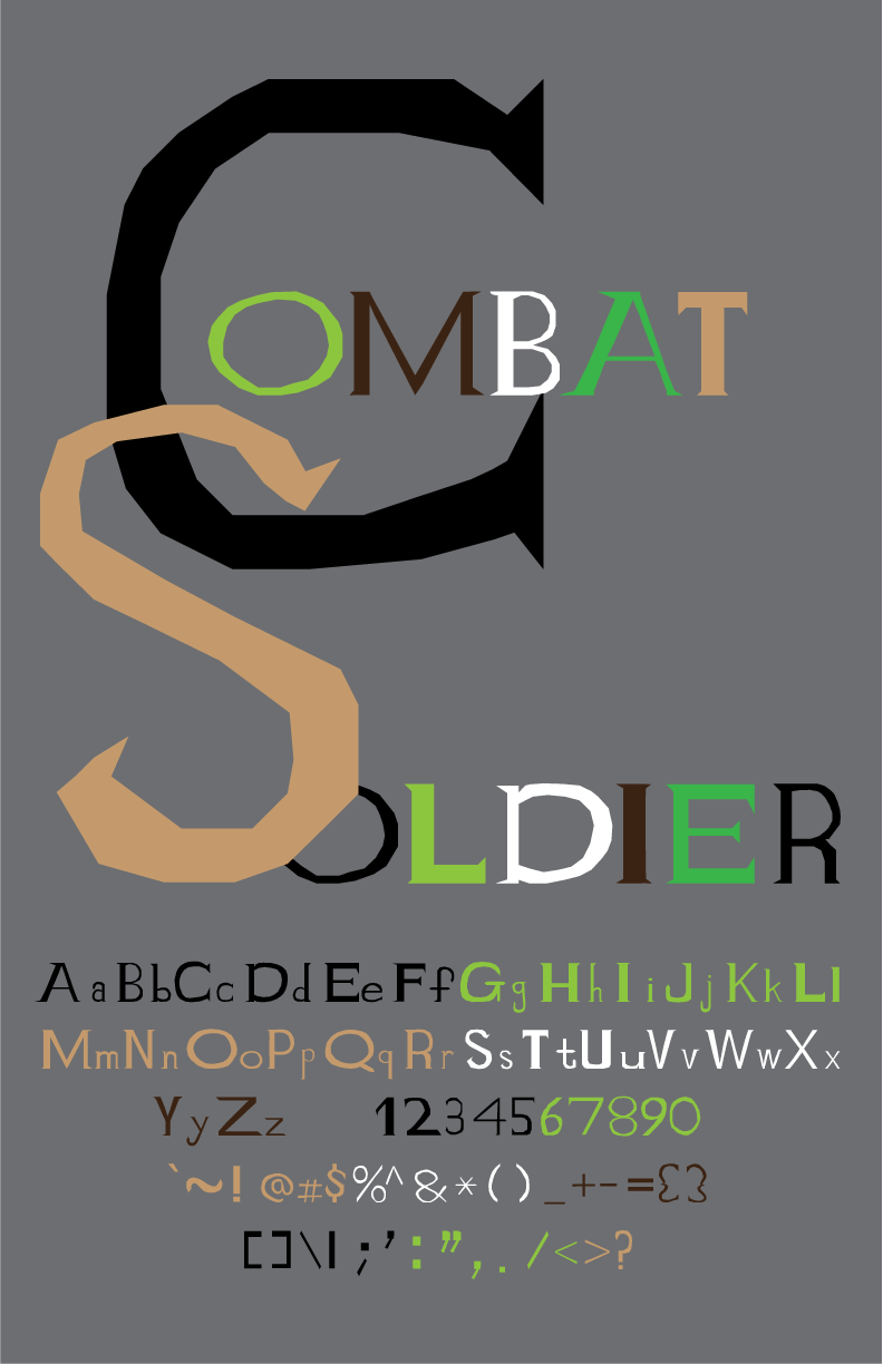
*As an added bonus, I have added to all my project title pages in this web portfolio the capital letters of my “Combat Soldier” typeface.
Top of Page