
On this page, you will see the process I went through from conception to completion. Including a final result on some of them or placed in an environment.
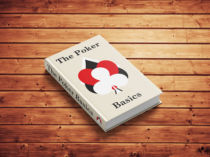
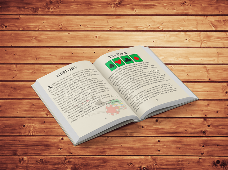
This was a three-part project that ultimately tied in with one another, a poker book, deck of playing cards and a box that carried them. Out of the three projects assigned, the deck of cards was a team project.
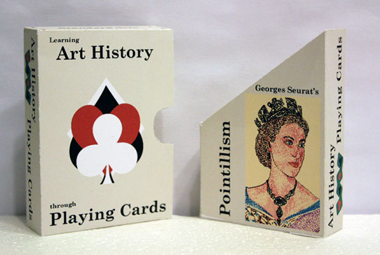
In the two individual projects, the poker book (see above and right photos) was designed first with copy provided and was to be perfect bound. We were to also implement our own design style for both the book and structure for the box (see the first and second box photos below).
First Box Design
This was my first attempt at making my poker box and having it closely resemble my poker book. Unlike the traditional looking card playing boxes, I wanted to take the non-traditional route and be different with my template as well as my surface graphics.
The package is a two-part box, the diagonal-cut insert holds the deck of cards and the cover completes the shape of the box. I also included the cover of my book graphics to the front-side of the box, along with other portions of my “original” artwork for the rest of the box sides.
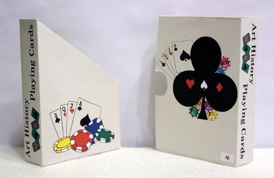
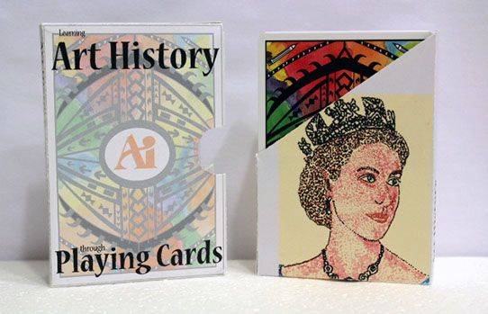
Second Box Design
This is my second version of the same box. We were instructed to make the box resemble the back side of the deck of cards as shown with the school logo centered within. I made the obvious changes by adding the back card image to the front side of the box and made a similar image with all the suites on the backside combined that was previously done for my first box and book cover. I also made other changes on the insert and not only placed the queen image, but wrapped it underneath and mirroring the image on the other side.

FACE CARD
I was assigned the Queen of Clubs face card and was to come up with a photo of a “queen-like” figure and make it resemble Georges Seurat’s Pointillism artwork. The famous figure I chose was a 25 year old version of Queen Elizabeth II of Great Britain.
The pointillism artwork really wasn’t too difficult to do, although it was complicated to pull it off. First, I used ultra-fine sharpie markers to stipple the colors for the photo and did each layer of color individually on separate cut-out 8.5” x 11” plastic document protectors. A total of 6 colors were used for this card, black, pink, blue, brown, red, and purple. When each layer was combined and scanned into Photoshop, the background color was added and the overall photo was cropped to fit the card and the box shape.
This is a the final version of the Queen of Clubs card shown here.
