On this page, in some projects you will see the process I went through from conception to completion. Also, including a final result or placed in an environment.
This collateral project was made for a local non-profit organization that we were interested in designing items for. I focused my attention on designing a brochure, stationery and billboards/web ads, etc.
As seen in the images, the name of my chosen non-profit is the Firehouse Cultural Center located in Ruskin, Florida. Their mission is to offer quality programming with a focus on a full spectrum of the arts, and on education for all ages. These programs encourage participation, engagement, discovery and learning.
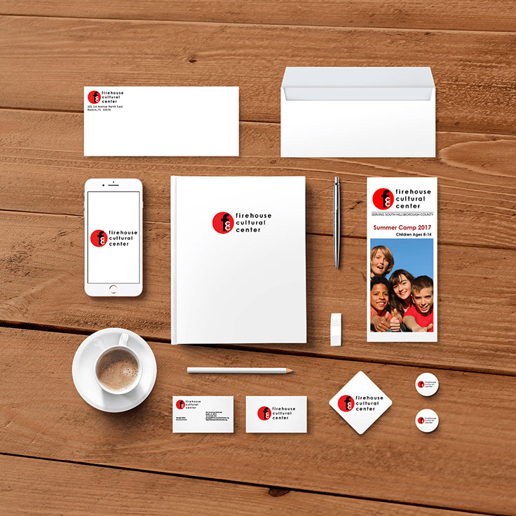
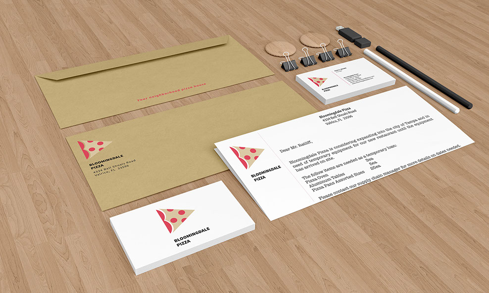
To the left, you will notice all the professional stationery redesigned with a focus on the business cards, the envelope and additional take-away items visible like the coaster and badges. A mobile application landing page, a brochure and a possible idea for a hard cover book or notebook cover are other possibilities for future collateral uses.
As you can see in the photo to the right, the brochure for summer camp was my main focus, I wanted to break down a lot of the redundancy that they currently are using and make it more inviting and simple to read through.
In the front panel of the brochure I wanted to put in the obvious, since it is a summer camp for middle school children.

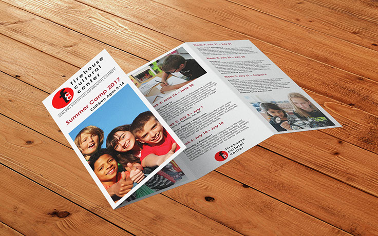
The inside panels (left side photo) list out all the summer class dates being offered in bold color headings and the descriptions below it making it easy to follow from panel to panel.
Instead of just having copy to read throughout the entire brochure, I added some photos of children who are actually participating in certain classes to make it less boring with black copy.
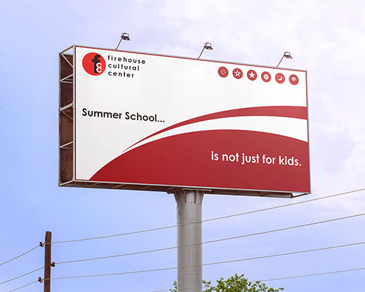
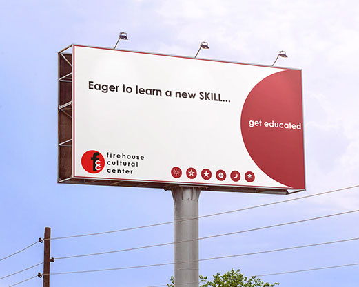
I dabbled with other collateral pieces such as billboard advertising (below photos), I made a couple different versions of the billboard/web ads that could be posted in town or simultaneously on their website. I didn’t want to go with too much imagery and stayed with similar shapes and color from the logo itself and the copy on the ad was simplistic, I also used some of the symbols they use for their educational programs in house so it’s recognizable by those who frequent this organization.
Corporate ID - Branding
In this project, we were to create a brand manual for a mom and pop pizza restaurant in our local area that consisted of a brandmark redesign, collateral items and exterior signage.
You will also see some of my process work to get an idea of what I was initially fleshing out in thumbnail sketches and what I ultimately came up with.
I chose Bloomingdale Pizza located in Valrico, Florida, as my pizza place for creating my brand manual.
After conducting an interview with the owner of the pizza establishment, and thorough research of their company from the website and social media they already had in place, I began my process of coming up with a new brandmark.
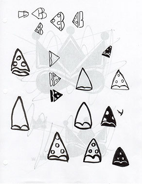
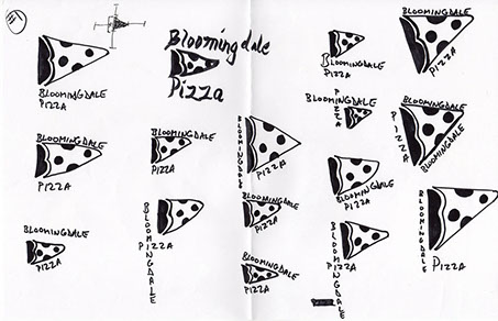
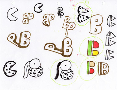
The sketches above, are just a few of the multitudes of concepts that I came up with that ultimately became the final version of the redesigned brandmark for Bloomingdale Pizza.
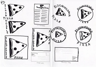
To the right, is the brandmark I created for Bloomingdale Pizza, it’s a pizza slice which represents two characteristics visually. The letter “B” in the crust of the pizza slice is for the name of the restaurant and the rest of the slice is for the primary product they sell. The intent for the redesigned logo was making it look more simple, modern, recognizable and family-friendly.
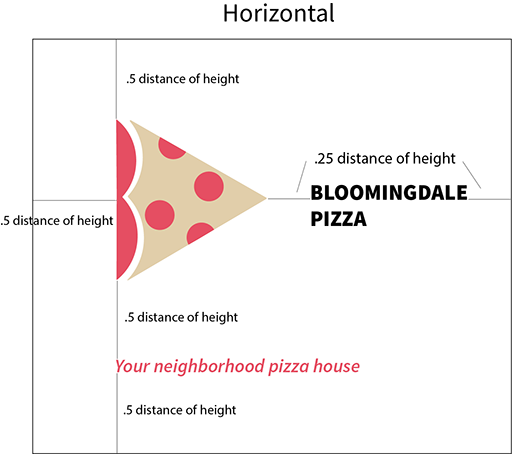
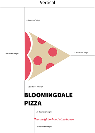
Below, are some of the white space parameters shown and the minimum and maximum application sizes for the Bloomingdale logo, it's from .5 inch to accommodate such items as a name tag, to as large as an exterior building signage. The length is measured from the left side of the Pizza crust shaped letter “B” to the right side of the pointed edge of the pizza slice.
Also shown are the two different application methods, horizontal and vertical.
These parameters should be used when applying the logo on any collateral as seen in the photo at the beginning of this project and for pizza boxes and the website shown below.

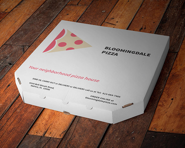
This is an example of how the pizza boxes would look like when using the new brandmark to identify Bloomingdale Pizza, instead of having a generic box with no identity of the restaurant as most mom and pop restaurants tend to use because they are cheaper to purchase in bulk.
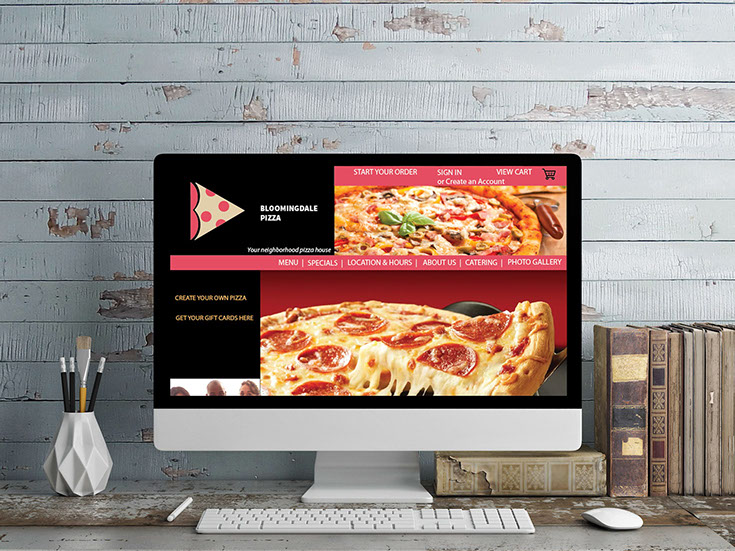
To the right, is an example of how the redesigned website could be like with the new brandmark in place. It’s a bit more inviting with vivid looking pizza images to entice webpage visitors and in the navigation bar it includes links to find menus, specials, location and hours, catering options and a photo gallery link.